A fresh coat of paint + new stuff coming soon!

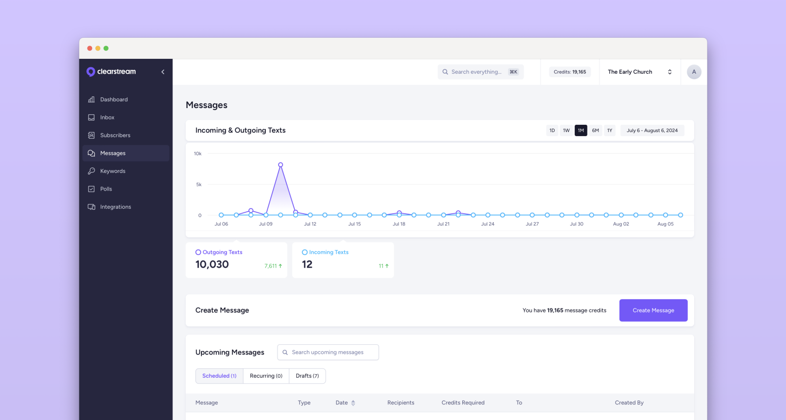
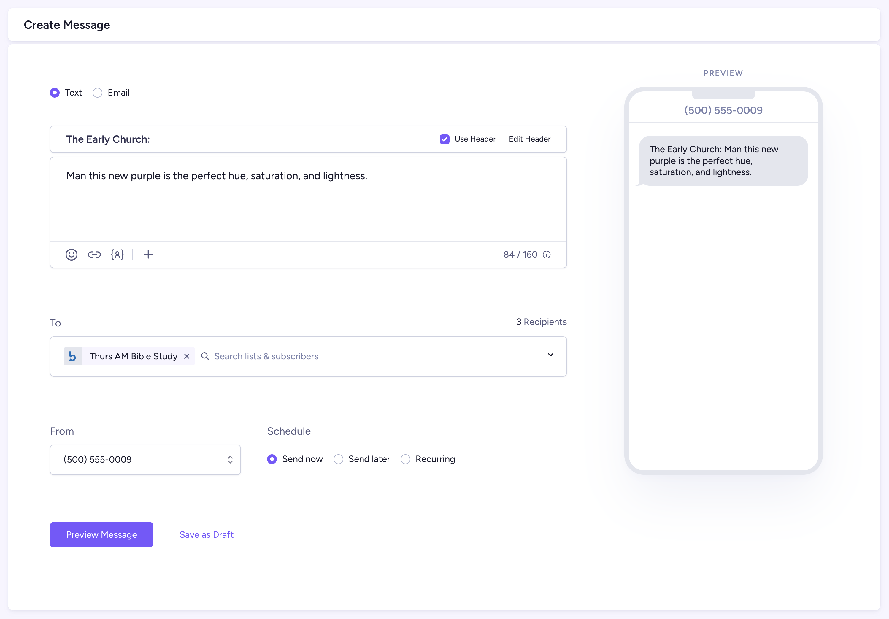
Today you'll notice that Clearstream looks a little different. After updating our logo earlier this year, we've been working on bringing our new branding over to the product, releasing incremental improvements over the next few months. We hope these changes not only make Clearstream easier to look at, but easier to use!
Pink is out. Purple is in.
We've finally said goodbye to our long-standing primary pink color. You've served us well for so long, but it's time for something new.

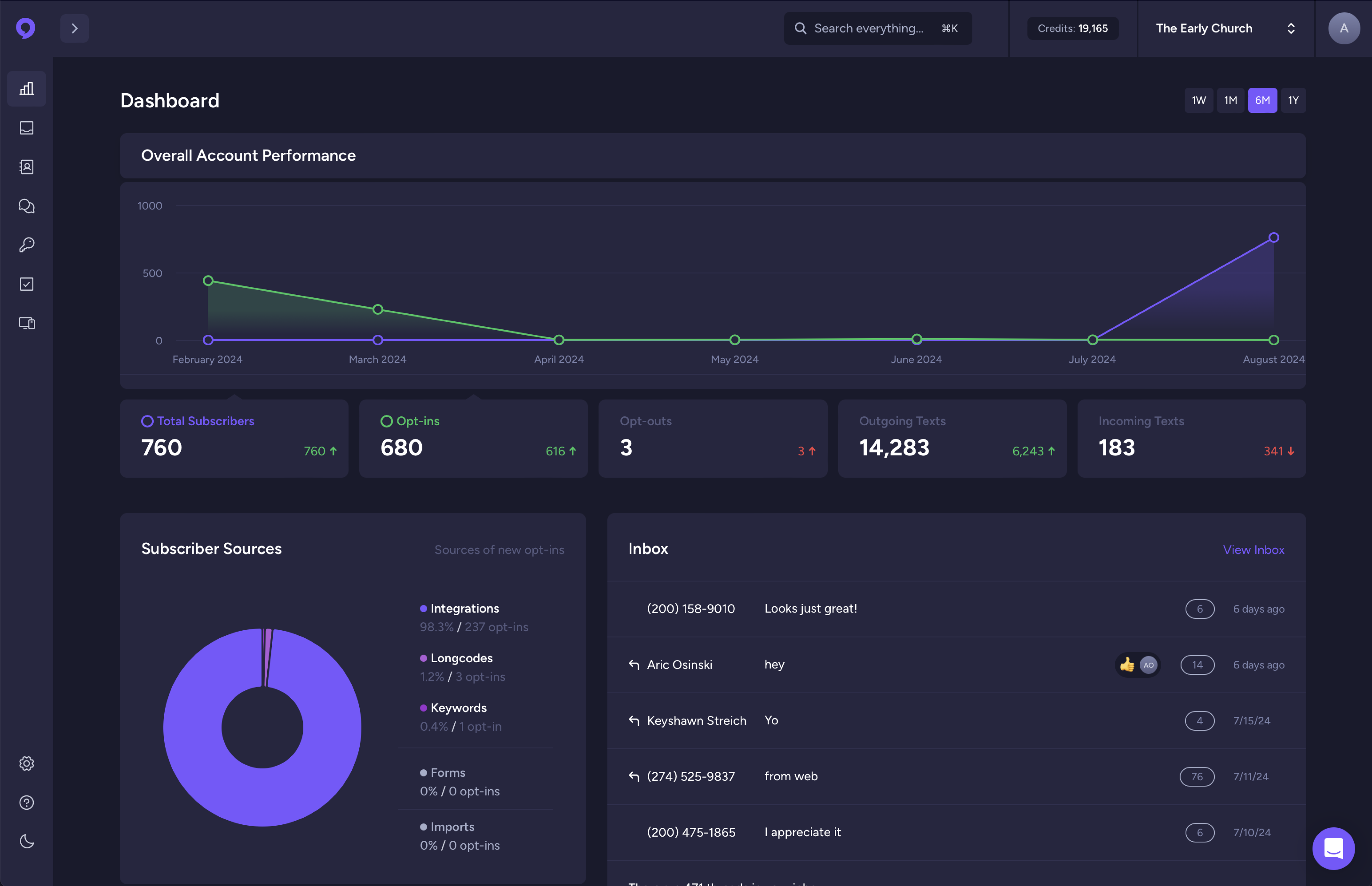
A better dark mode
There's a long-standing feud internally between Michael and me about dark mode versus light mode. But for those give-me-dark-mode-or-give-me-death types, we've spent a good amount of time improving dark mode to make it easier to use and more pleasing to the eye!

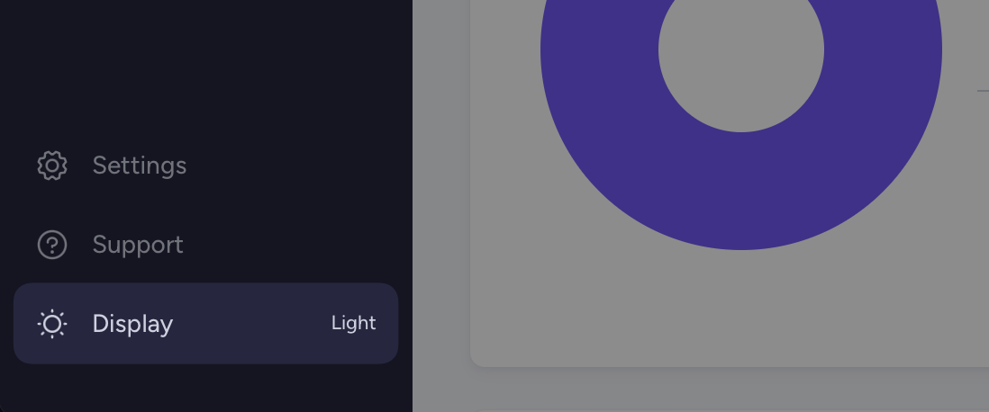
We've also moved the dark/light mode toggle to the left navigation at the bottom. By default, the app will follow your system preferences and automatically choose between light or dark mode. But you can easily override this and your choice will be remembered.

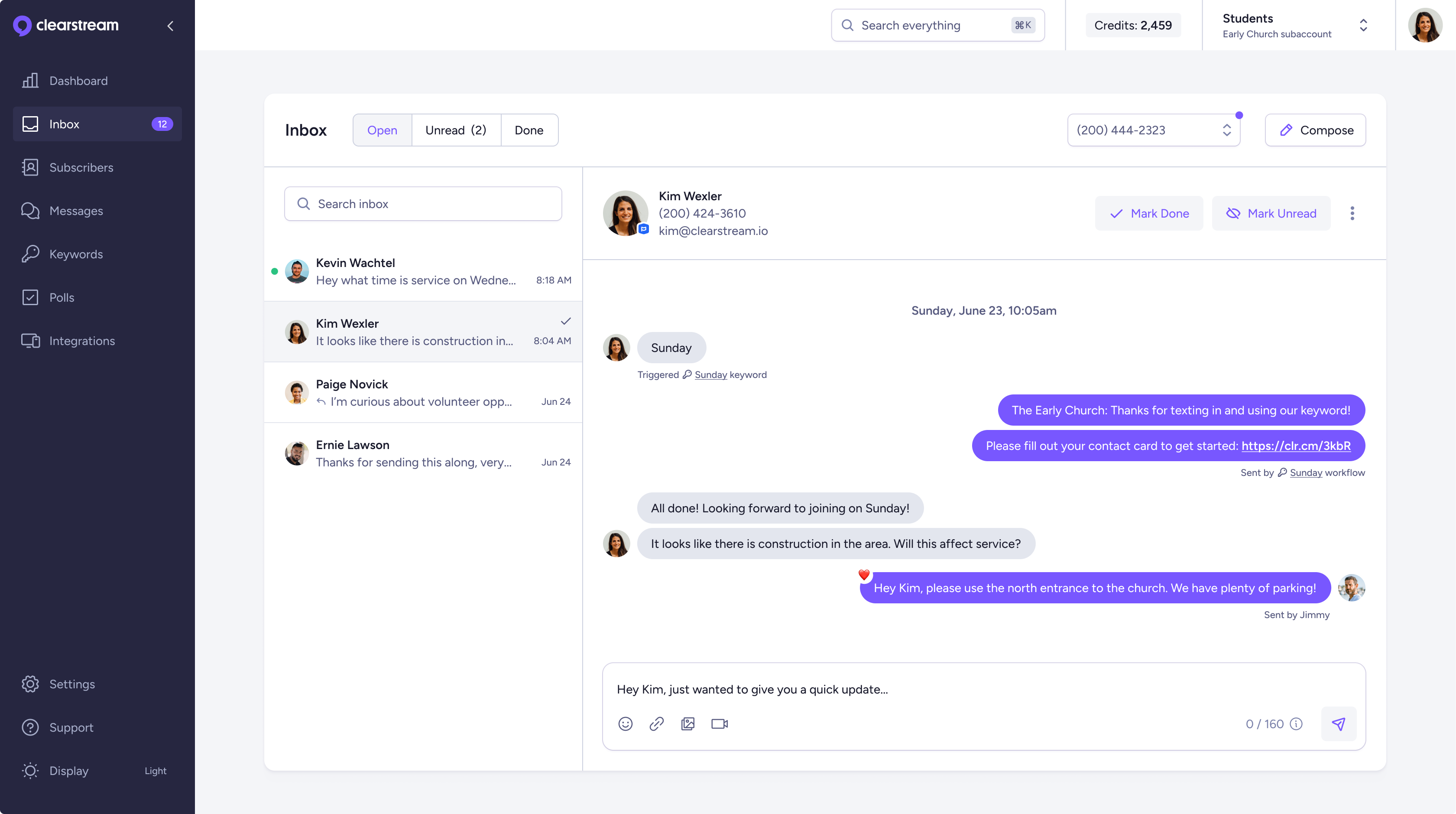
A sneak peak at our brand-new inbox
One of the long-standing customer requests has been an improved inbox with more context for one-on-one conversations. The good news is we're very close to releasing an incredibly powerful brand new inbox experience! This has been one of our biggest goals for 2024, and we're so excited to be releasing it soon!

iOS/Android apps are getting a major upgrade
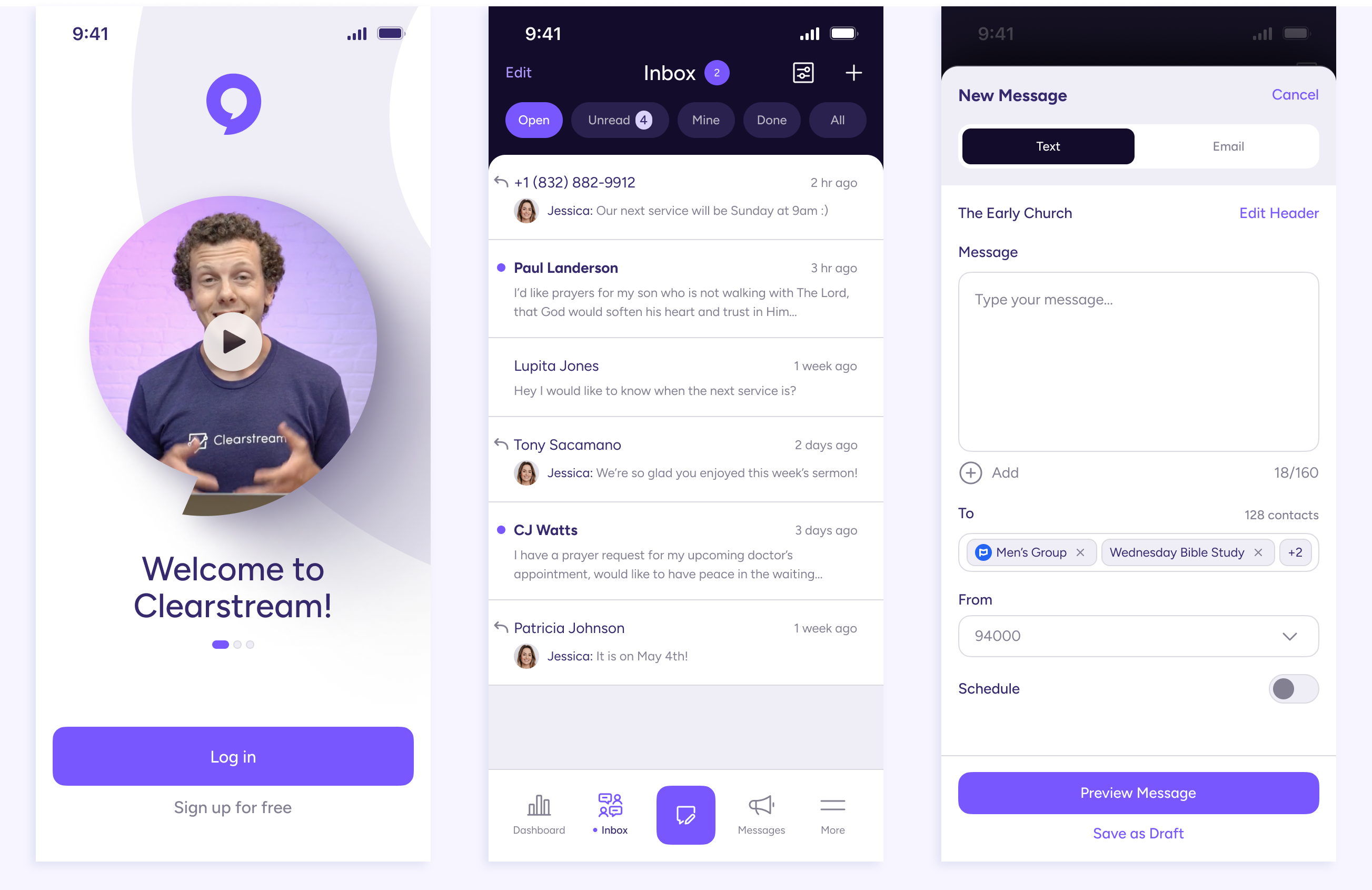
Another major effort for 2024 is a complete redesign and redevelopment of our mobile apps. We'll be releasing this new version in the next 3-4 months, first on iOS and then on Android.

Updates & improvements every week
In addition to large new features, we're constantly releasing minor updates and improvements every week. Be sure to pay attention to our product changelog and follow along!
We also are very proactive in listening to customer feedback. If you've got a suggestion, please let us know!